Why did I buy this? A review of the Kobo Libra Colour
No really, why did I buy this?
From the title you may assume that I dislike the Kobo Libra Colour, but I actually really like it. What I don't like is the Kindle Oasis, or that form factor for my e-readers more broadly. Because that's what the Kobo Libra colour is, an Oasis-like e-reader from Kobo.
This is a difficult review to write, mainly because there isn't much to say that I didn't already cover when reviewing the downsides of the Kobo Clara Colour. Same company, same recycled plastic and repairable device credentials, same hostility to sideloaded e-books and audiobooks. So I suppose I should focus on the differences.
I'm not going to give a bullet point list for this one as I don't fancy repeating myself. So I suppose I'll start by saying I don't like Oasis-like devices because they tend to be less ergonomic for my small hands and are at best awkward, at worst impossible, to fit in my pocket. A portable device I can travel around with needs to be a grab-it-and-go size. Unless I'm going to need it, I don't like carrying a bag or rucksack with me if I can avoid it. I enjoy the freedom of chucking things in my pockets and walking out the door. The 6 inch size of the Clara Colour is great for this, but these Oasis-like 7+inch e-readers are just too big.
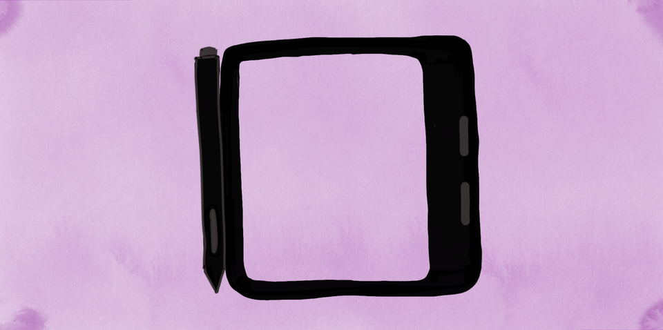
Another needless irritation is the awkward locations for the magnetic stylus: lopsided on the front right where it is easily knocked off in your bag, or on the left edge where it falls off when you open it if you're using a cover. Why not have a magnet on the outer right edge for it where it won't be hindered by a case but sits flush with the profile of the device? Between this and the size, this is just not the device I want to reach for when I want to get reading.
For some reason most Oasis-like e-readers also seem to miss the importance of weight distribution in the design of the Oasis. The weight of the device is centred around where you are supposed to hold it. This makes it pretty terrible if you want the device to lie flat, but great for reading comfort. Because the Libra Colour also boasts note-taking capabilites, it needs to be able to lie flat for writing. So while I understand why the Kobo Libra Colour only gently widens towards the holding edge, too much of the weight of the device is still constantly pulling away from your hand, causing wrist strain for small hands over prolonged reading periods, unless you have a surface to rest it on.
The Kobo Libra Colour is also one of the heavier devices I've looked at, coming in at 208g without a case, 304g with an official case, and 320g with a case and stylus. For comparison, my Kindle Paperwhite, which has a narrower form factor, is 206g without a case and with a generic case is 318g. It's going to sound weird, but even with the case and stylus, side by side the Libra Colour does feel a little lighter in my hand because of the slight tapering than the Paperwhite, but it's an extremely slight difference.
There are some design choices in the form-factor of the Libra Colour that I really like. The way the holding edge curves at the corners and has a slight lip to it make it very comfortable to hold, especially with my thumb resting on the inner curve of the holding edge. It's pleasant, just not over a long period of time when the weight of the device slowly starts to fight me. This is then compounded by the terrible page turn buttons.
They are simply too far apart to use with one thumb, and they don't respond to presses evenly across the surface of each button. It is much harder to press the buttons from the middle edges than the outer edges. This makes trying to turn a page without significantly moving your hand each time more of a chore than just tapping the edge of the page, making the buttons seem redundant.
The standout feature of the Kobo Libra Colour for me is the note-taking app and stylus of this device. I like the simple "it just works" user interface (UI). Writing on it has a pleasantly matte feel too. Not quite like paper but definitely not the gliding slidey experience of writing on something like an iPad. I like the bigger screen when writing as it's like having a small notebook to hand. It's also got pretty incredible battery life. I think I've only had to charge it once since I bought it and I've had it for months now. I actually use this device fairly often for note-taking, but not reading.
As a note-taking device the Kobo Libra Colour is easily my favourite. The UI is so simple my 4 year old nephew had it figured out in seconds and happily doodled away, drawing things in different colours, starting new pages and erasing mistakes. I even used it to write up all my notes for these e-reader reviews. Using it is comfortable, simple, and intuitive. I can order my notes into folders, back them up to my Kobo account on sync, and export them to Dropbox or Google Drive if I want to. Easy and convenient.
I also saved money by buying a second-hand Metapen M2 for it for £22.95 including postage from CEX, instead of the official stylus which is a whopping £69.99, and it works pretty perfectly. I even prefer that the erase button is flipped around on the Metapen compared to the official stylus because I erase much more than I highlight so being able to press the side button instead of having to flip the pen around works nicely for me. Another thing I like about the stylus (official and Metapen) is that it activates on movement so you don't have to switch it on to use it, you just pick it up and write like a regular pen.
I also tried the Metapen M1 as an alternative because it was only £17.95 including postage from CEX. It also worked well but I found the side button placement to be annoying. It was awkward to adjust you finger high enough to press the highlight button vs having that functionality being on the top end of the stylus like an eraser on a pencil. I also found that the buttons on mine where just too sensitive compared to the M2, and because of the way the M1 stylus sits in my hand, I would end up accidentally pressing the erase button constantly. So if you decide you want a Libra Colour and want to save by avoiding the official stylus, the Metapen M2 gets my recommendation, especially if you get it second hand as it's cheaper and you don't have to buy it via Amazon.
Because the Libra Colour is a note-taker, it does have wireless sideloading capabilities via Dropbox or Google Drive, a feature that is sorely missing from the Clara Colour. The vividness of the colour also pops more on the Libra Colour than on any of the other devices I've tried. Other than that nearly all the same issues remain: The lack of reading progress sync for sideloaded books with the mobile app, and the terrible, awful, inhumane sideloaded audiobook player. It's so frustrating.
I mainly bought this e-reader because a friend of mine was looking for an alternative to the Kindle Oasis to get away from Amazon. Sadly, this device fell very short of meeting their expectations. They disliked the plastic casing, the awkward buttons, and the slight graininess that comes pretty standard with all colour e-ink screens.
I saw so many reviews gushing about this e-reader before I bought it. I really did hope that with the wireless sideloading, waterproofness, and added note-taking functionality, I could overlook the size of this device. Unfortunately, it just wasn't meant to be. Now it's a very expensive notepad for me, and not much else. So yes, I like it, but not as an e-reader.
Join me next time in this e-reader madness series for a review of the Pocketbook Verse Pro Colour. Toodles!